
After Vocabulary.com was acquired by IXL Learning, I was responsible for leading the restructuring of the site’s landing page to better reflect how users actually engage with the product.
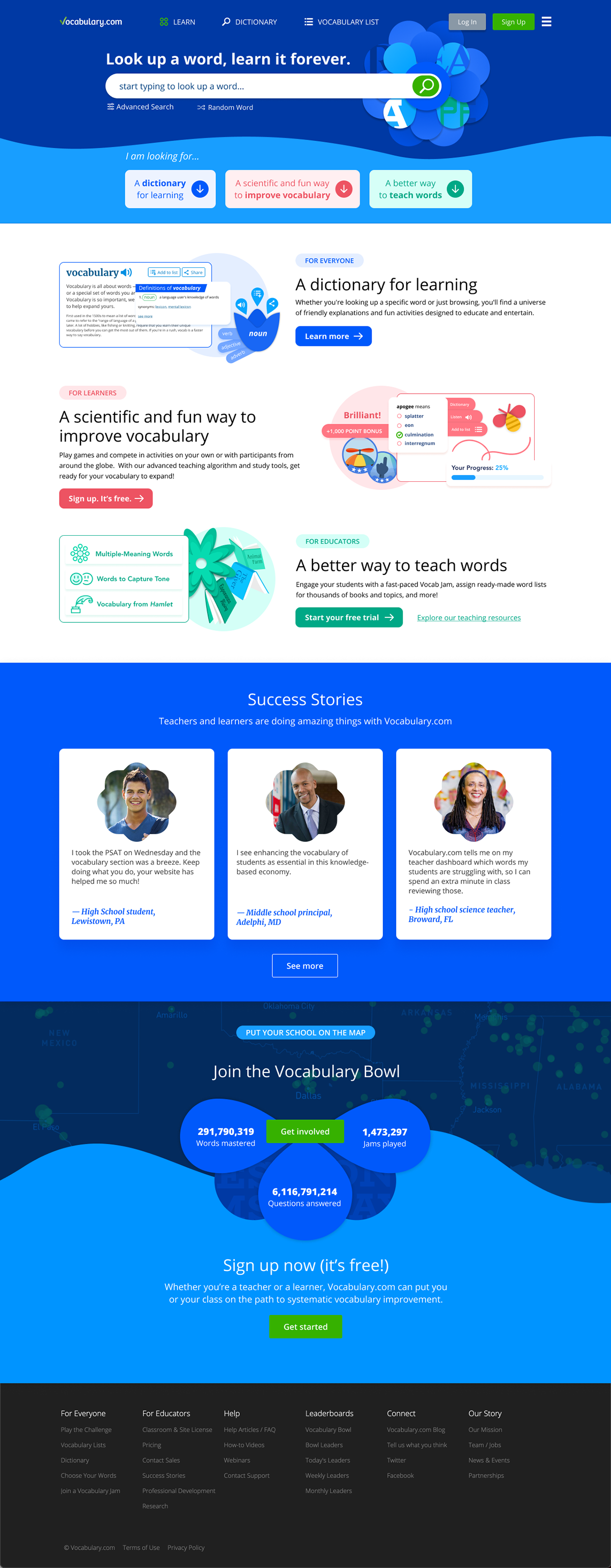
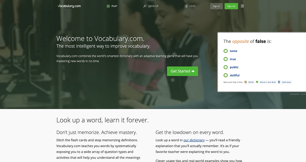
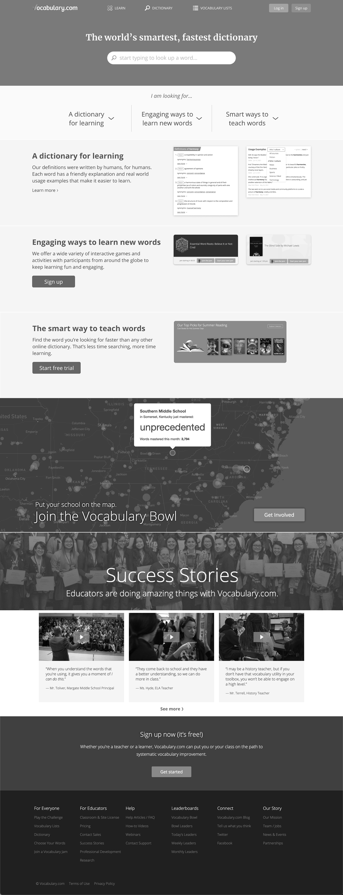
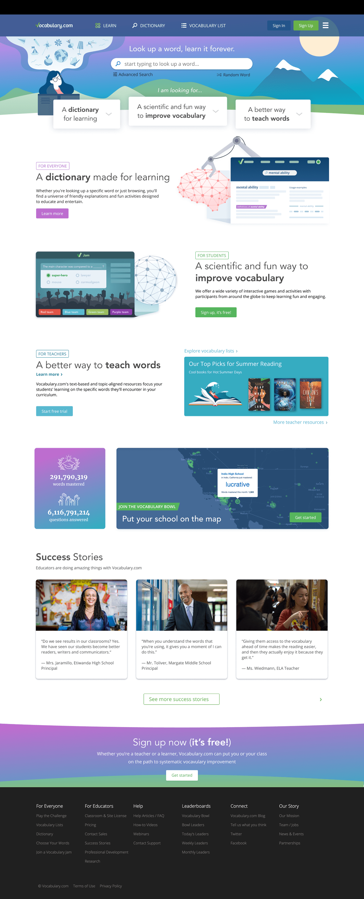
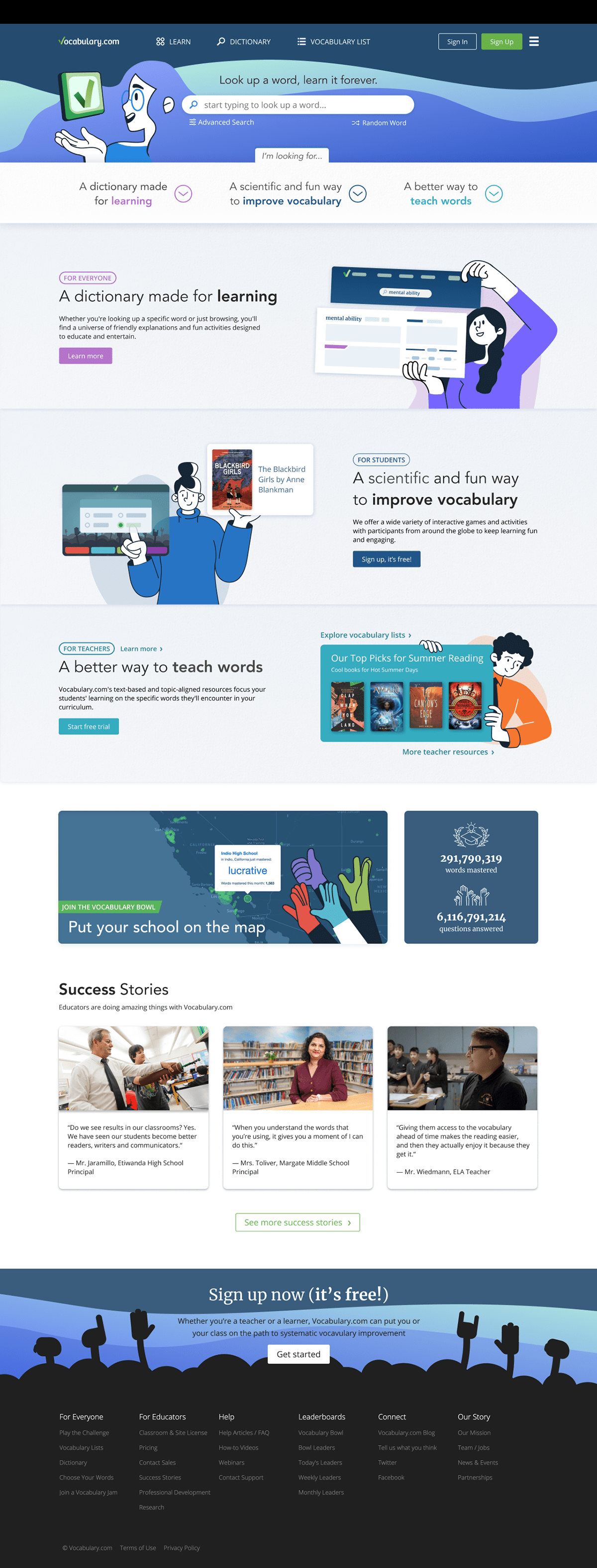
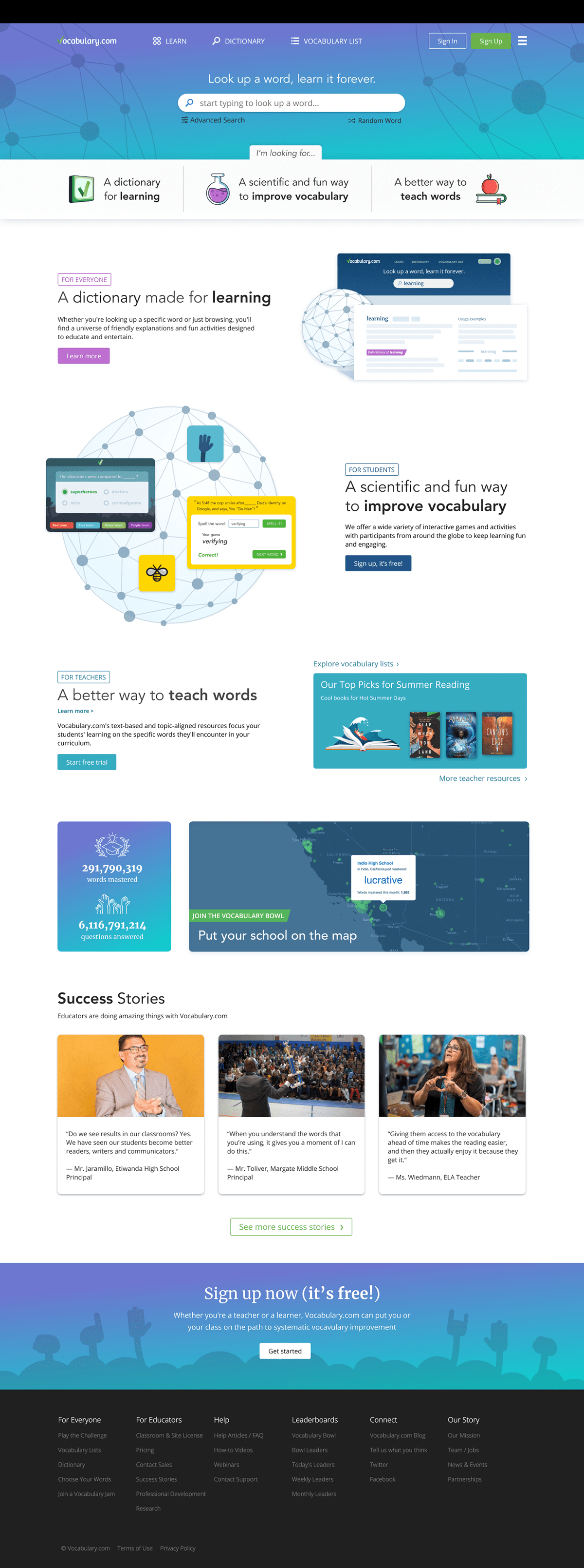
The existing landing page attempted to do too much above the fold at once. Core dictionary functionality was visually and structurally diluted by competing elements, including dense copy and secondary features that distracted from the primary use case.
My focus was on information architecture and content hierarchy, clarifying what Vocabulary.com is first, and how secondary learning tools should support that core experience.
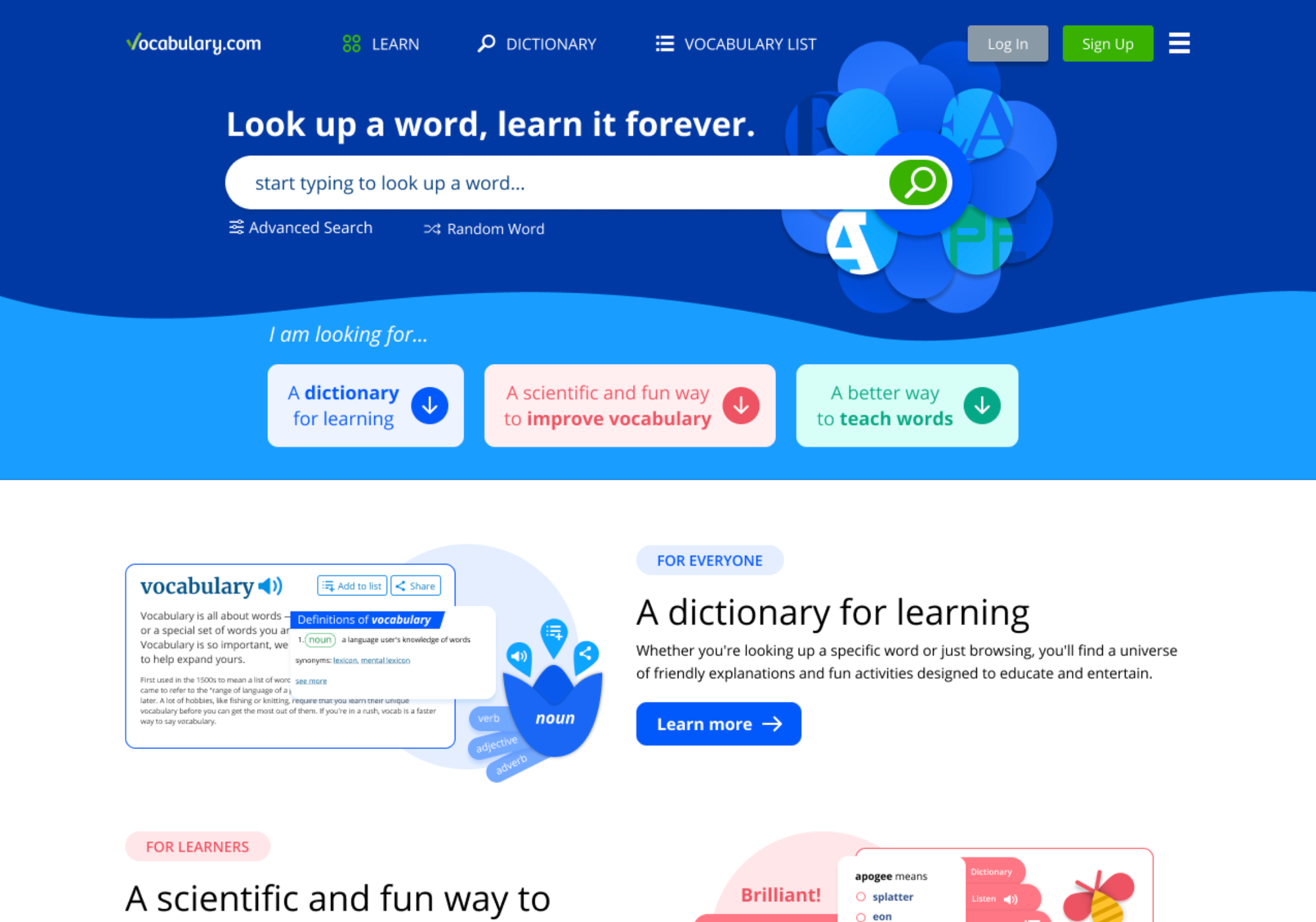
I worked through multiple visual and structural explorations to simplify the top of the page, reduce cognitive load, and guide users more directly into word lookup and related educational features.
The experience was intentionally structured to emphasize the dictionary at the top, with supporting marketing content introduced progressively as users scrolled.
This approach clarified the primary purpose of the site while allowing secondary features to surface without competing for attention.
While a designer on my team handled the visual and graphic execution, I directed the overall structure, flow, and functional emphasis of the page.
The final result presented Vocabulary.com as a focused, approachable dictionary-first experience, with teaching tools integrated in a way that felt intentional rather than additive.